
The vision and intention behind Quinnipiac University’s strict brand identity was the result of a collaboration between the university and independently-owned design studio, Pentagram.
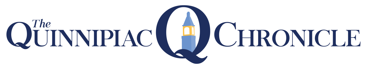
The controversial logo, which drew community attention in 2016 after a petition was formed in opposition of the lowercase ‘u’ in university, took months and a well-established design team to construct.
In 2015, Quinnipiac University launched what was formerly called the Office of Brand Strategy and Integrated Communications–now the Office of Integrated Marketing Communications.
[media-credit id=2143 align=”alignright” width=”300″] [/media-credit]As it grew, Quinnipiac noticed the need to construct a department focused on one universal strategy. Since then, Quinnipiac has restructured and streamlined its marketing strategy across the entire university.
“Our office carefully manages the university brand identity and flagship communication platforms like QU.edu, all of our social media channels and the on-campus digital display network to name a few,” James Ryan, associate vice president for Quinnipiac University’s Office of Integrated Marketing Communications stated in an email. “We also closely partner with schools, divisions and offices to help elevate and unify marketing communications across the university.”
Ryan wrote that since the university has experienced “incredible growth over the last couple of decades,” the brand had to grow alongside it.
“The reality is, while the university was experiencing all of this growth, our brand and how we created and shared our narrative with the world did not keep pace,” Ryan stated. “That’s why our office exists. To partner with students, faculty, staff and alumni to share our incredible story in a powerful and unified way.”
- [media-credit name=”Autumn Driscoll / Quinnipiac University ” align=”aligncenter” width=”300″]
 [/media-credit]

MORE THAN A LOGO
But, the Quinnipiac brand isn’t just a logo, according to Ryan.
“Our brand is defined by the entire experience a person has with Quinnipiac,” Ryan stated. “And the brand comes to life in different ways for different people, from a visit to our website or liking one of our Instagram photos to proudly wearing Bobcat gear or spending years on our campuses or at home pursuing a degree. As proud members of Bobcat Nation, we, in many ways are the brand and all have an important role to play when bringing our amazing story to life.”
With Pentagram, the university established ‘brand identity guidelines’ used as a resource and point of reference that outlines proper usage of brand assets, such as logo, colors, fonts, etc., to drive consistency across any and all executions, according to Ryan.
This includes research, planning and implementing marketing strategies, as well as managing the university’s website, all social media platforms, creative services, video production, photography and editorial services.
“We complete more than 1,200 creative services, photography and video projects for the university community each year and are on track to exceed that number this year,” Ryan stated. “From creating commencement programs and publishing the Quinnipiac Magazine, to producing our annual holiday video and designing all of our athletic teams’ uniforms and playing surfaces, we have the privilege of creating content that not only informs but also excites and inspires people around the Quinnipiac brand.”
In 2016, The Chronicle reported that then senior, Brett Segelman created the petition “Revise the New Quinnipiac University Logo” after backlash stemming from the lowercase ‘u’ design in University.
Since then, it appears that the school has dropped university in its logo entirely, as seen on the website, QU.edu.
“I think the story about the logo has been told,” Ryan stated. “We’re looking forward – focused on all the other exciting ways we are bringing our brand to life.”

In collaboration with the university, Pentagram’s team and partner Eddie Opara developed a ‘brand identity system’ which functions as a consistent university-wide brand.
“We hire outside partners to work with us to create content that either requires expertise that is outside of our core skillset or sometimes if we simply do not have the capacity to complete a given project,” Ryan stated.
Kenneth Deegan, associate partner and designer at Pentagram was a part of the team that worked on the brand from start to finish.
“My role was pretty hands-on throughout the entire experience and even after that we got to work a little bit further with Quinnipiac for John Lahey’s retirement book [The Lahey Years],” Deegan said.
“These projects tend to be anywhere between six months, up to a year,” Deegan said.
[media-credit id=2143 align=”alignright” width=”300″] [/media-credit]They worked on print production material, signage, graphics and towards the end of the project they worked on the design of the public safety vehicles.
“Quinnipiac has been really quite reputable for its poll–obviously everyone is aware of that,” Deegan said. “We were also made aware of the growth the university has actually undertaken.”
The Pentagram team visited Quinnipiac’s campuses a number of times throughout the process, according to Deegan. It was a constant back and forth between the two locations.
“Later on in the project we also art directed the photography that became a library for the visual identity,” Deegan said. “We worked with a photographer to capture the landscape, the grounds, the students, sports shots and everything. It really was a very hands-on experience in every way. Quite an intimate process in that sense.”
Their process started off by speaking with students, staff and touring the campuses.
“It is a sophisticated university with expansive offerings, the campus itself is in a beautiful location surrounded by nature,” Deegan said. “All of these characters and aspects of the university needed to be distilled in a logo mark, a logotype and an identity system that could hold those together and represent them a little bit better than the previous one was doing.”
Keeping schools like, Yale, Harvard, MIT as well as University of Chicago and Stanford in mind while designing the logo, Pentagram knew it needed a design that would stand out. They choose a lower-case logo because they felt it would be more approachable.
“We were looking at how we could visually compete against these guys,” Deegan said. “Part of the initial task was to look at typography and how that was going to communicate across the university’s identity.”
Quinnipiac wanted a brand that could compete side-by-side with big-name schools, like Yale. They were looking for a clean design that would stand out.
“We became aware of how competitive our universities were finding it in the U.S. to stay ahead of the curve, to gain a regional, national and also an international presence,” Deegan said.
They designed custom lettering as a way for the university to be distinctive and recognizable.
When asked how much a project of this scale costs, Deegan said it varies on the client and did not give an estimate as to how much Quinnipiac spent.
A GLIMPSE INTO THE PAST
The previous logo was in all-caps. During their initial research, Pentagram looked at universities across the country and specifically in the northeast and noticed that many had a repetitive theme.
“All of these universities and colleges shared the same approach,” Deegan said. “It was all-caps, Serif typography, in a way corporate safe-blue color.”
The original logo came at a time when Quinnipiac sought to fit in with other universities when now the idea was to stand out, according to Deegan.
Pentagram has had numerous educational clients, working with City University of New York, Columbia Business School and Yale.
“One of the things to also note was the presence that was put on the ‘Q’ as a mark,” Deegan said. “The ‘Q’ seemed like a symbol that would be a pretty powerful thing to work with. Fortunately, not many other universities were working with that. It really was a goal to create a system that would live far beyond the first few years.”


